Two prototypes — Lander and Rover — put in front of the support agents and admins who would actually live in them.
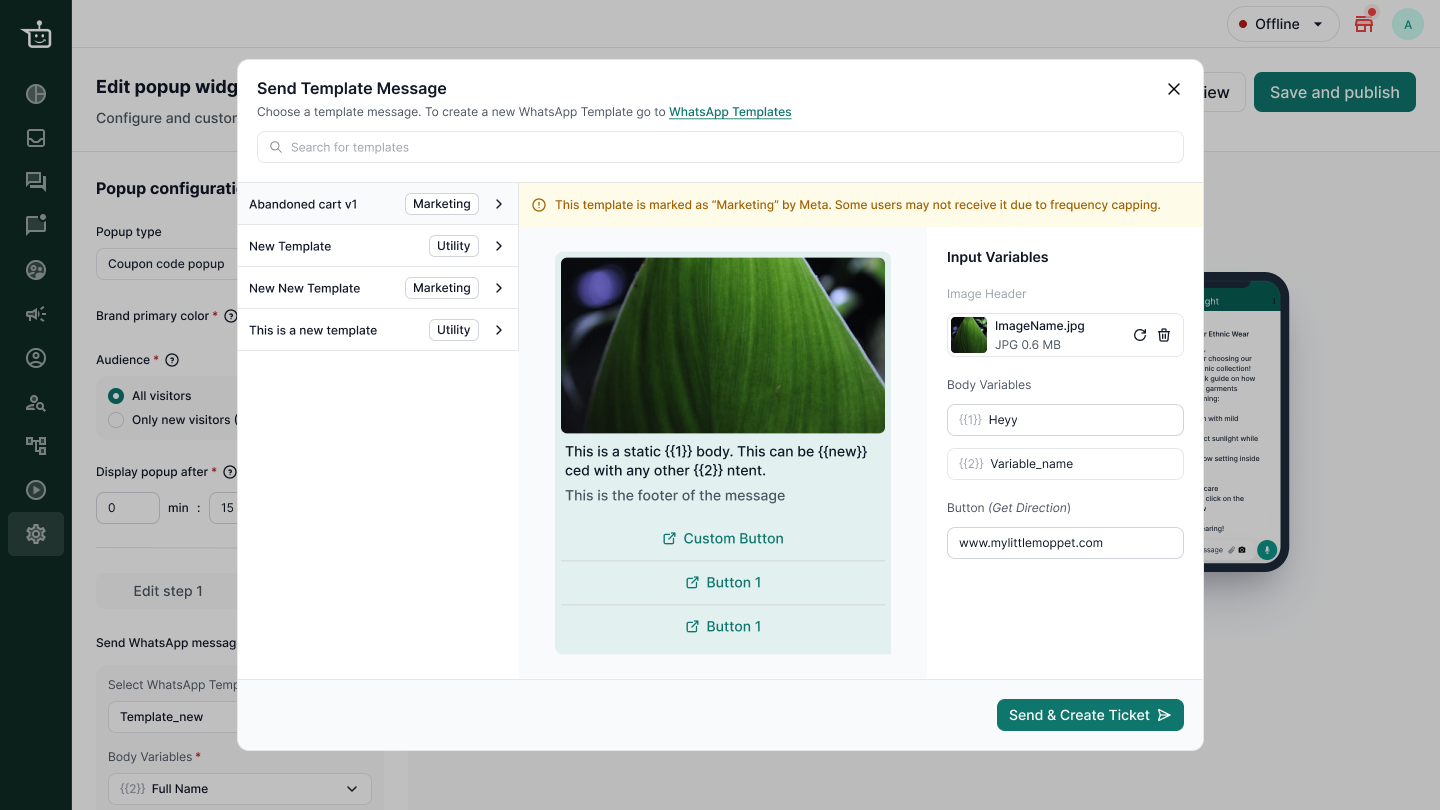
To study user preference and usability of template selection across two approaches.
Designed for clarity, but with more interaction cost.
Designed for faster execution, but with less guidance.
One global component could work for both admins and agents.
Moderated interviews and preference tests, run on two prototypes.
Everything on one surface. Fewer steps, less guidance.
One decision at a time. More steps, more scaffolding.
Why those names
I prototyped both flows using Figma Make and named them Lander and Rover, so neither carried a numerical or sequential bias when users compared them.
What I measured
Support agents and admins, across three brands.
 Aweri
Aweri Tribalveda
 Bloome
What I asked each group to do.
Agents
Admins
The two groups split, cleanly, in opposite directions.
Couldn’t edit the variable. The interface was cluttered, with “Template listing”, “Template preview” and “Template config” all present at once.
The interface successfully guided them to their goal.
Fast execution. Fewer steps to send a message.
Slower execution, and friction when talking to 40–50 customers each day.
The split wasn’t about taste. It was about how often each group opens the product.
An average agent replies to 40 to 50 customers a day with templates. That repetition builds habituation, and any added interaction cost slows down response time, which puts CSAT at risk. Context heavy suited them because it asked less of them each time.
It’s not their core work, so they haven’t built the same muscle memory. They needed the flow to guide them, and that’s what Rover did.
What started as one global component split into two variants, each built for the environment its users actually work in.
That decision also made the component reusable elsewhere: wizards, node editors, conversational interfaces, and settings screens all now run on it.
 Work
Work About
About Contact me
 Resume