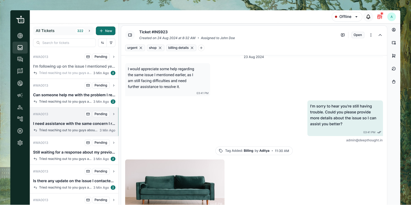
Veirdo’s support agents used the inbox to chat with customers, resolve queries, and admins used it for analytics and reports.
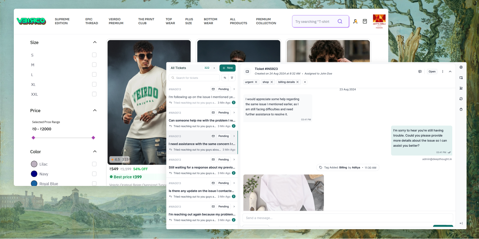
Both the user segments were misinterpreting the ticket header.
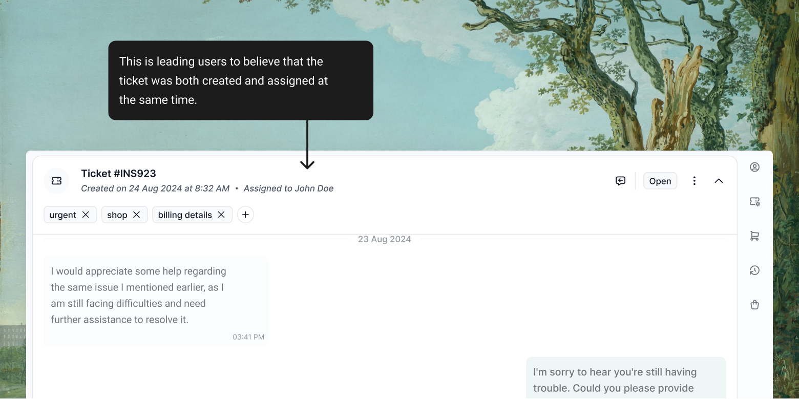
It looked like the ticket was created and assigned in the same moment, when it wasn’t.
I needed to fix the misinterpretation users had without touching the rest of the inbox.
I tried three approaches, each one came by solving the last one’s constraint.
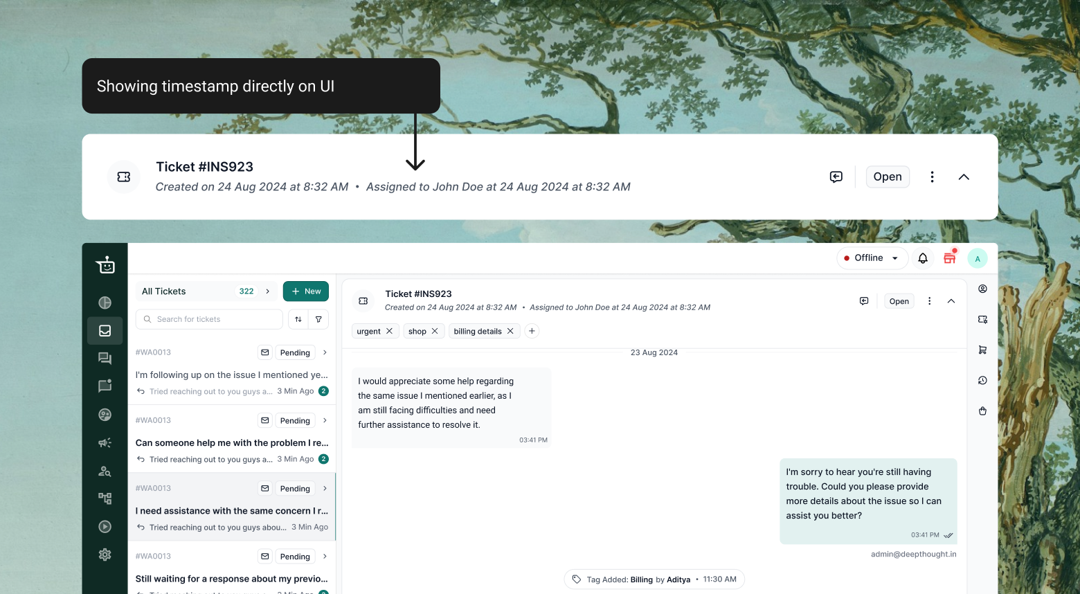
✕Assigned time was not the first thing a user needed to see on scanning the header.
✕The header was already dense. Adding a second timestamp added to the clutter and made the scan worse, not better.
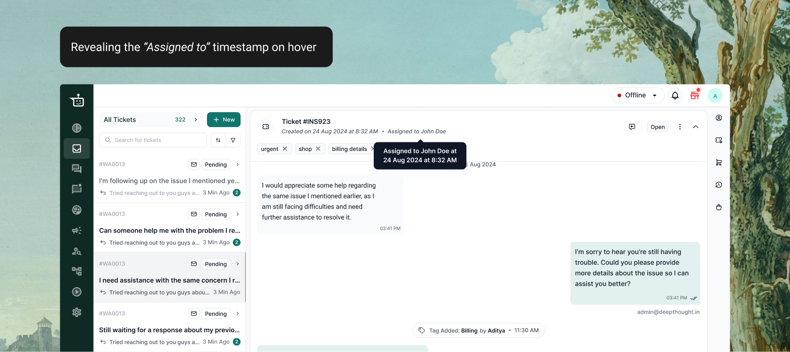
✓It helped cut the clutter.
✕But it only revealed information after hover. The first scan stayed exactly as misleading as before.
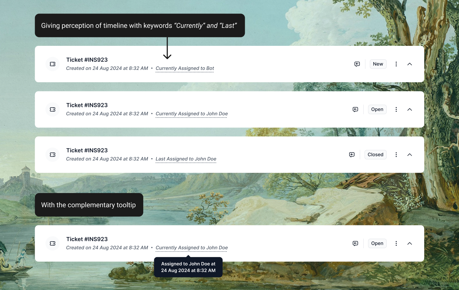
✓Introduced conditional verbiage: Currently Assigned to John Doe while the ticket is still with that agent, Last Assigned to John Doe once the ticket is closed.
✓“Currently” or “Last” gives a perception of timeline.
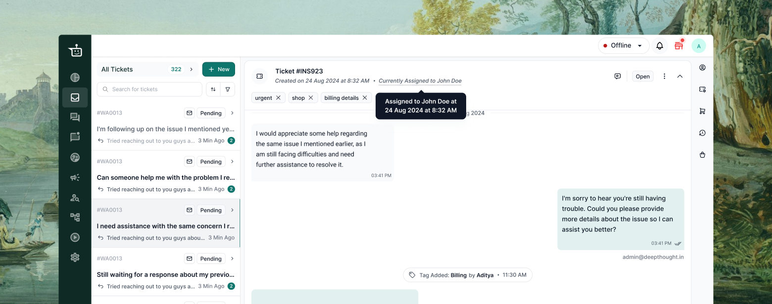
✓I retained the “Assigned to” timestamp on hover, so the exact timestamp is still there for anyone who needs it.
The ticket header is now more contextual, and more aligned with user perception.
People read things their own way.
I’ve learned to direct where the story goes.
 Work
Work About
About Contact me
 Resume